Learning from Bus Buddhists
In psychological terms, context is almost everything. Much as we like to think that we know how we will act and react in a given situation, without the richness of...

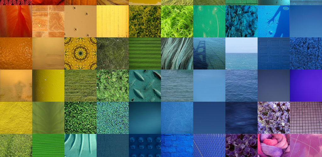
Does Colour Matter?
Whilst I was listening to the final of the Australian Open on the radio a brief debate emerged between the two commentators, Jonathan Overend and Pat Cash.
Overend, who does extraordinarily well keeping the listener in touch with what’s happening in the rallies, made a passing reference to the colour of Roger Federer’s shirt, describing it as “purple”.
Cash queried this, suggesting it was more of a blue. Overend, with a delightfully flawed piece of logic, pointed out that, since the court was blue and since Federer’s shirt wasn’t the same colour as the court, the shirt could not be blue.
For the record Nike, who make the shirt, describe the colour as “concord”, whatever that is!
I’ve quite often experienced similar situations: one person innocently labels a colour and another counters with an alternative. It makes you wonder if we all see the same thing?
With colour labelling being so subjective, it has always seemed to me somewhat dodgy when people have suggested that there is a science behind how we react to colours. If we don’t see them in the same way we’re hardly likely to react similarly.
Indeed, there is no shortage of pseudo-science and new-age mysticism to be found on the subject. I typed “colorology” into Google not knowing what I would find, and 14,300 entries were returned, many promising that my life would be enhanced immeasurably if only I were to spend a little money and get the right colours in my life.
Some offered to throw in psychic readings based on my “life colour”. No thanks.
The scientific world has not devoted too much attention to the issue of colour. There are a few theories and studies around but, given how colourful life is, surprisingly little has been studied in depth.
Recently a couple of new pieces of research have shown that colour does change behaviour and there are important implications for anyone with something to sell.
The first study will be of particular interest to sports fans – and doubly so for fans of English football who may have seen the Chelsea player Frank Lampard (blue football shirt) sent off in a match against Liverpool (red shirts); a refereeing decision that was subsequently judged to have been unjust, and consequently over-turned on appeal.
Researchers presented 42 experienced Tae Kwon Do referees with footage of competitors sparring and asked them to score the contests.
In the clips the colour of the competitors’ clothing was digitally altered so that the same competitors were shown in both blue and red at different stages.
They found that when competitors were wearing red they were awarded, on average, 13% more points than when dressed in blue. The suggestion is that the referees have a split second bias towards red.
Another study released this week looked specifically at colour in the context of consumer behaviour. It also found that the choice of colour affected consumer response.
600 participants were given a range of cognitive tasks to complete on a computer screen, which was coloured blue, red or white.
Researchers found that people asked to undertake creative tasks, such as generating ideas, produced twice as many when working with the blue screen. Conversely, red boosted performance on detail orientated tasks, such as proof-reading, by as much as 31%.
The researchers also looked at response to advertising and product packaging using different colours.
They discovered that a red background led to a more favourable response to advertising that contained specific product details. When blue was used people favoured more evocative, creative messages.
In a similar way, negative messages were more influential with red, whilst aspirational messages were more likely to influence with blue.
These research studies are further evidence of the importance of unconscious associations in determining how people behave.
Associations with red (such as warning signals, danger and stop signs) lead to more care and attention to detail.
Associations with blue (open spaces such as sky and water), and the experiences that people have in those places, lead to more free and fluid mental processing.
Clearly there is a long way to go in colour research – that is if once we get past the primary colours we can agree on what colour we’re actually researching – but even these basic studies reveal the importance of considering colour as a communication tool in consumer communication.
Sources: Association for Psychological Science (2008, August 10). Red All Over: How The Color Red Affects A Referee’s Judgment. ScienceDaily. Retrieved February 7, 2009, from http://www.sciencedaily.com ¬ /releases/2008/08/080808114930.htm
University of British Columbia (2009, February 6). Effect Of Colors: Blue Boosts Creativity, While Red Enhances Attention To Detail. ScienceDaily. Retrieved February 7, 2009, from http://www.sciencedaily.com ¬ /releases/2009/02/090205142143.htm
Image courtesy: jakerome