Learning from Bus Buddhists
In psychological terms, context is almost everything. Much as we like to think that we know how we will act and react in a given situation, without the richness of...

Consumers’ Colour Preferences
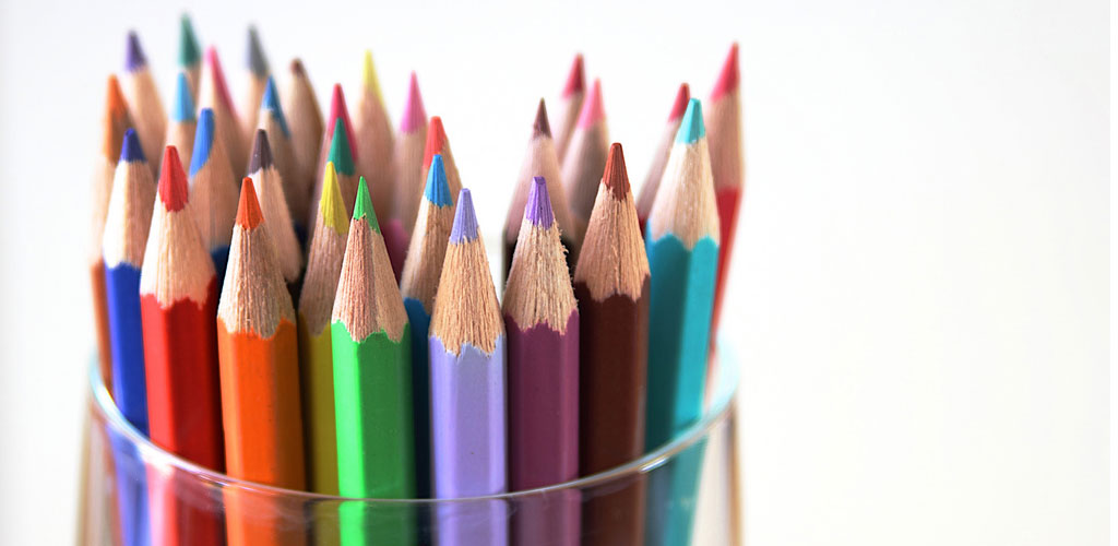
One of the many challenges in product design is making colour choices. It feels (and is) extremely personal, but new research gives us some clues about what consumers want.
Quite a lot of research has been done on individual colours, their connotations and how they influence consumer behaviour.
Much of this is driven by the unconscious associations people have with those colours. For instance, if red has frequently been associated with warning signs or danger, it is helpful that our unconscious minds have adapted to notice that colour first: it wouldn’t be great if we allowed ourselves to get distracted by the millions of other visual elements in the landscape when what we need to see is the “Beware of imminent death” sign someone has considerately placed next to a hazard.
As I wrote about previously, these unconscious associations can have unexpectedconsequences.
But what about the use of different colours? Starkly contrasting colours might catch the eye (although blocks of one colour have been shown to be very effective too), but do these appeal to consumers more or less than colours that are closer together?
Researchers recently made use of the NIKEiD customer training shoe design service to explore how customers chose to combine colour themselves.
With NIKEiD you pick a basic model and then select the colours you want for the different panels of the shoe (in all there are seven elements you must choose colours for including the logo).
The team analysed the designs people made and used the CIELAB color space model to gauge how close or distant the colours they selected were to each other.
They discovered that people chose a small palette of closely matched colours for their shoes, although a large minority also selected one contrasting accent colour, typically for the special sole that was a signature component of the shoe.
To explore whether this was just a consequence of designing the shoe, the researchers also asked people to pick from one of four Nike-designed shoes on the website. They found that people chose the designs that combined similar colours rather than those that had a mix of contrasting ones.
I own a pair myself and my design was very much in keeping with what the researchers discovered.
What drives this preference is intriguing. It feels to me that there is something confident and assured about a less contrasting design, and conversely something anxious and attention-seeking about a wild combination of colourse. Apple products are a great example of designs that use minimal contrasting colour to feel elegant and confident.
As children we are often much more daring with colour and have far less regard for what ‘works’ and what doesn’t. But before long we learn to become more colour co-ordinated. Similarly, young children notice everything in a shop and want to stop and touch everything, whereas as adults we learn to screen out most of what’s present.
I suspect that it is in this pattern-checking dimension of the unconscious mind that consumer preferences for closely-grouped colour emerge. Once we own something we don’t want to add to the distractions around us.
When it comes to designing products that customers buy with aesthetic considerations, choosing colours that work well together, rather than contrasting them, is probably a wise choice.
Source: Xiaoyan Deng, Sam K. Hui, J. Wesley Hutchinson.Consumer preferences for color combinations: An empirical analysis of similarity-based color relationships. Journal of Consumer Psychology, 2010; 20 (4): 476 DOI: 10.1016
Image courtesy: Doug Wheller